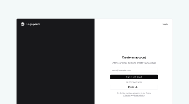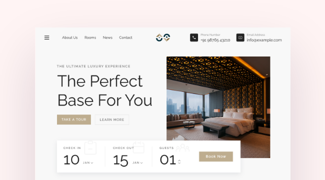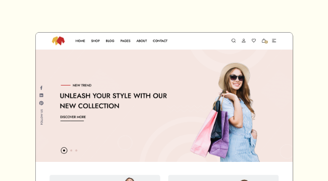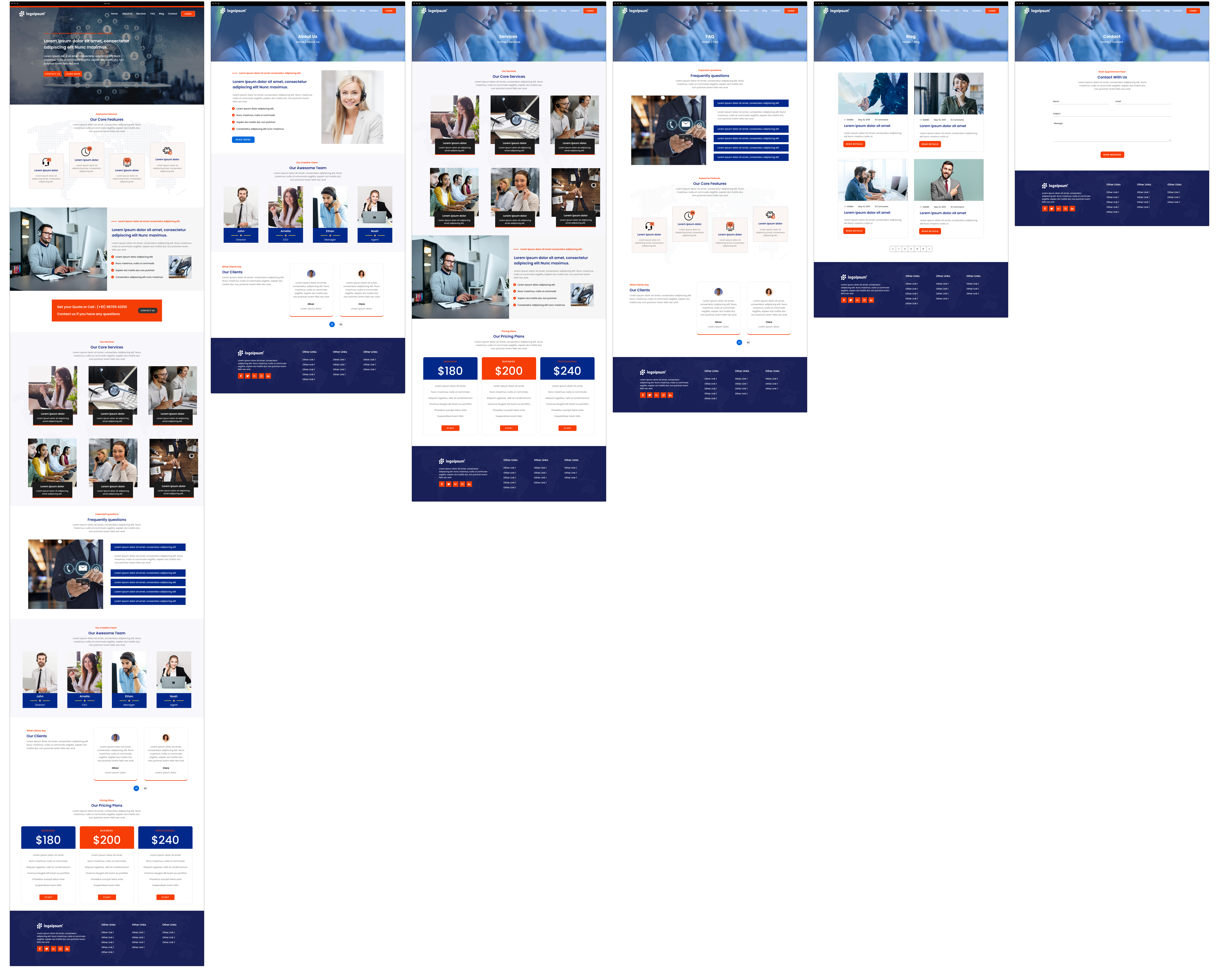
When creating a corporate website, each page must serve a distinct purpose while maintaining a consistent design language across the site. Key considerations include a clear content structure, engaging visuals, and seamless navigation. Essential pages, such as the homepage, service listings, team information, pricing, and contact forms, should be strategically designed to guide users through the customer journey, ultimately leading to conversions. A good website design for a corporate business should be visually appealing and user-friendly, ensuring that all important information is accessible without overwhelming the visitor.
This wireframe example showcases a multi-page corporate website layout. Each page serves a unique role, with a consistent professional design that employs a light theme, visually balanced layout, and clear call-to-action elements. The wireframe is mid-fidelity, offering enough detail to present a solid visual structure without overloading on specifics. It includes features like a structured homepage, service descriptions, team profiles, case studies, pricing tables, and a contact page, making it suitable for business websites focused on professionalism and client engagement.
Page-by-Page Overview of the Wireframe Example
Homepage
Header and Navigation: The homepage begins with a fixed header featuring the company logo, navigation links, and a "Contact Us" button for quick access. The menu guides users to essential pages such as "Services," "About Us," and "Contact."
Hero Section: The hero section features a large background image with a semi-transparent overlay to ensure text readability. The main headline quickly communicates the company's value proposition, and the CTA encourages immediate action. This design choice prioritizes user attention on the company's message, while the visual element adds appeal. A carousel could have been used here, but a static hero image was chosen to avoid distraction and focus on a single key message.
Service Highlights: A row of service icons with brief descriptions gives an at-a-glance overview of the core offerings, making it easy for visitors to understand the company’s capabilities right from the homepage.
About Us & Team Highlights: Below the services, a brief introduction to the company, followed by key team members' profiles, creates a more personalized connection with the audience.
Client Testimonials: Testimonials are placed strategically to add credibility and reinforce the company’s reputation. This section includes photos, names, and feedback to provide authenticity.
Footer: The footer includes contact information, links to important pages, and social media icons, ensuring that users have access to essential details no matter where they are on the site.
Services Page
This page expands on the services introduced on the homepage, providing more detailed explanations with supporting images and icons. The use of a grid format allows for a visually structured presentation, making it easier for users to differentiate between services. This layout prevents cognitive overload by compartmentalizing content. An alternative could be a list format, but the grid approach was chosen to create visual balance and interest.
Why Choose Us Section: This segment outlines the company's unique selling points. Using icons to highlight benefits visually breaks up the text, making the content more digestible. The icons also guide the reader’s eye, helping to emphasize key selling points.
Call-to-Action Area: Each service section is accompanied by a CTA encouraging users to request a quote, schedule a consultation, or view case studies, leading to higher engagement.
About Us Page
The design starts with a brief history of the company to provide context and establish credibility. The choice to include a concise background helps visitors quickly understand the company’s purpose. The information could have been delivered through a timeline or more detailed content, but simplicity was prioritized to maintain a clean aesthetic.
Team Section:Featuring team photos alongside short bios adds a personal touch and helps humanize the brand. This design choice is effective for building trust, as users may feel more inclined to do business with a company that showcases the faces behind the organization.
Our Values or Milestones: Displaying company milestones through a visual timeline adds a dynamic element to the page. This approach not only adds visual appeal but also provides a narrative structure to the company’s growth. Alternatively, a static text format could have been used, but the visual representation makes the content more engaging.
Case Studies or Portfolio Page
This page showcases the company's past work, with each project displayed in a gallery format for visual appeal. Each project includes a title, brief description, and link to more details, enabling users to explore further if they find a project relevant. The decision to use a gallery layout creates a visually appealing showcase that highlights the company’s achievements. A slideshow format could have been another option.
Filter or Categorize: Enabling filters allows users to find relevant projects more easily, adding to the user experience. This design choice ensures that users can quickly narrow down their interests without scrolling through irrelevant content.
Results and Impact Section: Including results achieved for each case study adds social proof and demonstrates the company’s ability to deliver. This section serves as more than just a showcase; it builds credibility by emphasizing measurable outcomes.
Pricing Page
The pricing table uses columns to present different service tiers, making it easy for users to compare packages. Each tier includes a list of features, highlighting differences clearly. This design choice helps users quickly understand what they are paying for, facilitating decision-making. An alternative layout with cards instead of columns could have been used, but columns provide a clearer comparison.
Add-Ons and Custom Packages: Offering add-ons provides flexibility, catering to users with different requirements and budgets. This section was included to give users more choices rather than forcing them into predefined packages.
FAQ Section: The FAQ segment addresses common pricing concerns, reducing potential objections. Including FAQs helps preemptively answer questions, which could otherwise deter a user from converting.
Blog or Resources Page
This page not only provides valuable content but also helps with SEO. The choice to include thumbnails for each post in the latest posts section enhances visual appeal and makes the page more engaging. Instead of a list, a card layout was chosen for better content organization.
Categories or Tags for Navigation: Including categories allows users to find content relevant to their interests, creating a more personalized experience. This design choice aids in content discovery, which could be more challenging without these organizational elements.
Subscription CTA: Encouraging users to subscribe to updates helps build a recurring audience. Including this CTA is a strategic move to capture leads directly from the blog page.
Contact Us Page
Contact Form: The form is designed to be straightforward, with only the essential fields to reduce friction. This simplicity encourages more submissions, as users are less likely to abandon the form. A more detailed form could collect more information but might deter some users from completing it.
Location and Contact Details: Including the company’s address and a map makes it easier for users to find the physical location, adding to the company’s legitimacy. The decision to include multiple contact options ensures that all user preferences are accommodated.
Social Media Links: Displaying social media icons prominently encourages visitors to connect with the company on various platforms, further extending user engagement.
Design your Corporate Website using MockFlow
This wireframe example is designed to provide a versatile foundation for a corporate website, with each page serving a distinct purpose while maintaining a consistent design language. The choices made for layout and content presentation aim to balance user experience with business goals, facilitating both user engagement and conversion. Use MockFlow's super easy wireframing editor to customize this wireframe example to fit your brand's style and functionality needs. With various UI kits and pre-made UI components available, you can quickly adapt the design to better suit your requirements and create a professional-looking website that effectively communicates your company's message.
