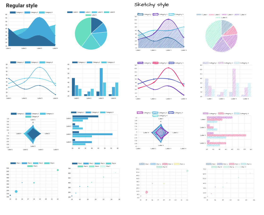
Updated Chart Components: 8 Types in Regular & Sketchy
The simple chart components that are currently available in MockFlow provide quick and basic visualization. However they have no labels and legends. And they are also limited in styling and types.
Today's update provides a complete set of new chart components with advanced capabilities and styling. Also they come in two different styles - regular and sketchy.
Both styles include:
- Easy coloring
- Grid option
- Legends
- Labels
- Sketchy properties
- Font styling
All the new charts, retain the same ease of entering data of the simple charts.
Now wireframe your dashboards and analytics UI layouts faster with the new chart components. And choose your chart style whether outline, high-fidelity or hand-drawn.
Included charts:
- Horizontal bar chart
- Vertical bar chart
- Area chart
- Line chart
- Pie chart
- Radar chart
- Scatter chart
- Bubble chart
Here is sample dashboard with sketchy styled charts. View here.
Share
:
0